The creation of product design from our point of view starts at the stage of idea creation. Whom is the product designed for?
A child? An elderly person? Or only for women? Maybe men?
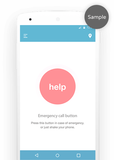
Further is more, button size and position, animation or its absence. For example in the case of children the more animation and the bigger and brighter it is - the better. And if we deal with an elderly person, he needs simplicity and particularly large interface size.
CONTACT

Services
Native design
development
NATIVE APP Design LEADERSHIP
-

IRYNA TARANOVA
UI, UX Designer
-

ANNA ZELINSKAYA
UI, UX Designer
We offer you to consider an example of well-timed, comprehensive and thoughtful search of answer on the question “What will the product I want to create look like?”
-
About
Sample:
Bantu means “Help” on malasian language. It helps elder people from Singapore, who like to travel; with Bantu they can make instant emergency calls and inform the relatives about any urgent and dangerous situations – even if they can’t talk! It’s not only the app for phones; Buntu is also available for smart watches.
Usage of Bantu on smart watches helps carrying users medical conditions and preventing emergency situations, allows automatically call to emergency services if user needs help, informs user relatives and attracts nearby passers through siren and flashlight when the user is unconscious.
-
Project objectives
Sample:
Client from the Singapore turned up with the idea to create an application for calling emergency. As a result of negotiations, we have formed the project objectives.
Business goal: Announce client brand; organize monetization system in paid app; create fast-working, attractive and easy in handling application for target audience.
User goals: Application should allow user to get emergency help, assistance and support of relatives in fastest and easiest of possible ways.
-
Competitive analys
Sample:
Together with marketing and analysts team references, similar apps and this part of mobile applications market was researched. We found a lot of apps, that provide useful features in case of emergency, but none of them solves the complex problem.
It was decided to select the Android platform as segment of these applications has been found free.
-
Result
Sample:
We have thought over, designed and developed an application design that is convenient, intuitive and easy for users, which is very important when it comes to the audience we have — elders.
Examination polls among older people and their relatives shown that 69% of them would like to purchase and install this application to their devices.
FEATURES
Mobile app
- One-tap call from any point of Earth to local emergency service
- The siren and flash to attract attention, if the user is unconscious
- Medical information on the lock screen Сall for help in the local language
Android wear app
- Emergency cars movement tracking
- Call which doesn’t need your voice
- User medical conditions tracking
- User most visited places tracking
- Map with user-friendly navigation
- Sending a signal to user contacts
DESIGN PROCESS
- Research
analysis - Persona
- Scenarios
- Architecure
- Wireframes
Userflows - Testing
- Visual
design
RESEARCH & ANALYSIS
Sample:
Before starting implementation of the project it was very important to gather information and analyze it. Because the degree of immersion of topic and possession of information depends the life of a user who needs help.
We have collected and researched a lot of information: competitors apps, articles, reports of Singapore Ministry of Health, independent organizations in the field of public health.
We studied the sociological, cultural and economic environment surrounding the users. Interviews were conducted with the client and the people from the target audience.
Research and analysis Step is required in order to create a successful application. This is the basis used by the analytic, which he can rely on the subsequent stages of the application. Attention to this stage can guarantee a successful outcome.
TARGET AUDIENCE
Sample:
Target user is the user archetype, that represents a certain behavioral model of user expectations, goals, experiences regarding the future application. Creation of the target user is determined by the user’s goals, and user’s goals achievement is the achievement of business goals as well. Target user is created based on an interview of the future app users or on the researches. This project was created on the basis of researches. In these studies, we have formed a target user with his goals, frustrations and needs. Singapore is high-tech, populous city with a good economy. Many older Singaporeans feel not safe: the arrival of emergency services is complicated due to the numerous traffic jams and huge number of skyscrapers.
There were cases when the ambulance did not have time to save a person, because of high car traffic or difficulty to find human in skyscraper. In such situations, every minute counts. So we decided that the implementation of rapid response in the app is function with the highest priority.
Bio
Lin works manager in a company that manufactures TV tuners. Despite the age, Lin confidently uses gadgets, because his business partners is IT companies.
He has heart disease and asthma. Lin is under control by medical experts, who provide constant expert help, but at any moment Lin may need extra help. He have a family: wife died, but there are children and grandchildren who care about him.
Lin travels often on business trips and it may also need emergency care abroad. Whenever visiting a new country, he is looking for the telephone number of emergency services, but it is inconvenient.
Frustrations
Not be safe
Children are far away
Ambulance / police will not arrive quickly
Losing control of the situation
Failure to obtain timely assistance
Inability to use the application at the real danger
Too complex application
Lin Ho
Age: 60
Work: Manager
Family: Widower,
kids, grandchildren
Location: Singapore
Character: Introvert
Needs
Quick medical treatment
Quick help by relatives
Environment
In the office, in a skyscraper
During trips abroad
Goals
Get quickly emergency help
Inform relatives promptly
USER SCENARIOS
Sample:
User scenarios are the certain situations of using app by persona. It’s about how persona will interact with the app in a given situation in order to complete a goal.
It solves problem in early development process. User scenarios allow to test app structure before it is fully developed and fixes problems in advance.
These scenarios were developed based on the persona. Each scenario has a user goal, that he wants to achieve through the app. Taking into consideration user fears, needs and the environment in which it will use the application.
Thanks to the development of scenarios for the Bantu, it was decided to implement a lot of useful functionality which solved the problem of users (such as the version of the app for android wear).
Initially, much of this was missed. Also some functions were dropped due to overloading of user’s flow and after we found better ways.
-
-
SCENARIO 1
Sample:
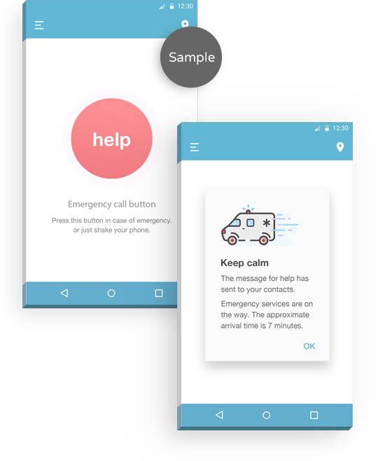
for smartphoneAt the lunchtime Lin decided to leave the office. Going down the elevator to the first floor, Lin stucked inside. Lin has claustrophobia and the panic attack begun.
Lin takes a smartphone and using the app calls the emergency services by pressing Help button.
Emergency comes at a specified time in the app and rescue Lin.
Comments: The application determines the exact location of the user through geolocation, finds the nearest ambulance and sends it to the user destination. App calls to emergency through WIFI/4G/GSM.
Through geolocation data of ambulance movement application determines and show the approximate arrival time to calm down the user.
Singapore is the city of skyscrapers, it’s important for emergency services always be able to find the user. The system determines the floor, through the height above the sea level.
-
-
SCENARIO 1
Sample:
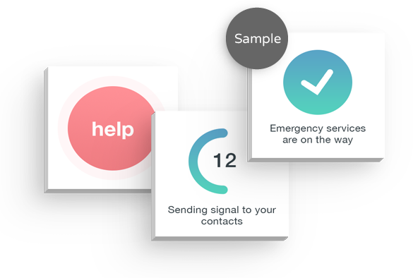
for smartwatchesLin went on vacation to Norway and due to climate changes Lin had asthma attack. Lin clicked the side button on the smart watches many times.
The app automatically calls to emergency services and sends signals to user contacts. Ambulance arrived at a specified time and rescue him.
Comments: This feature is useful for smart watches for those situations when it is impossible to call from the phone.
It can be a heart attack or cases in disadvantaged areas where you need a quick and shrouded call to police.
Smart watches read pulse and pressure, and if it does not correspond to a normal rhythm, If the user does not respond, the app automatically calls to the ambulance.
-
-
SCENARIO 1
Sample:
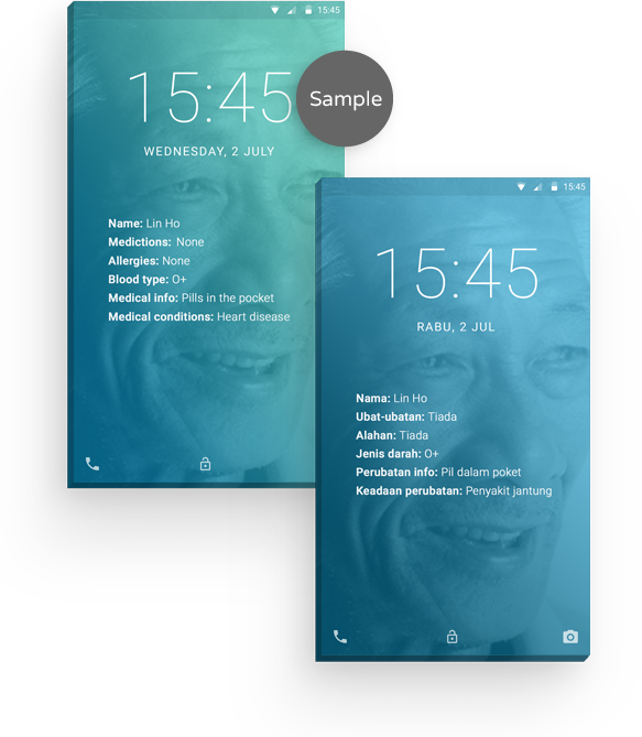
for smartphoneLin went for a walk in the park, he sat down on a bench and he suffered a heart attack. The application starts play a sound signal for help, which one attracts a passer.
Passer finds Lin and calls to the ambulance and found medical information on the phone lock screen “Pills in the pocket” and gives pills to Lin, it saves the life of Lin, before the ambulance not arrived.
Comments: Every time when user comes to another country app reads the database language that corresponds to the country/region. Depending on the country/region app changes dial emergency numbers, voice signal language for help and language for lock screen information about user.
The app retrieves the data from the server and if it is night-time, together with an audible signal for help it’s activated the smartphone camera flash.
APP ARCHITECTURE
Sample:
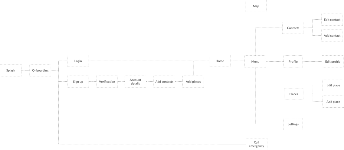
The application architecture it is a description of setup and structure of content in a manner in which a user can navigate through it. The systems are broken down into subsystems and connected to each other based on the relationship between them.
This is the foundation that is used for subsequent stages of app design and development. It allows to not turn app into chaos. At this stage we thought through the application logic, technology that will be used and the structure of screens.
App screens structure was developed on the basis of research and analysis of functions and wishes from the client.
WIREFRAMES & USERFLOWS
-
Sample:
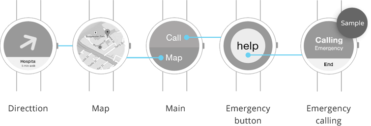
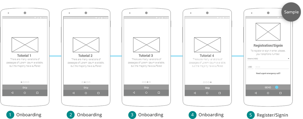
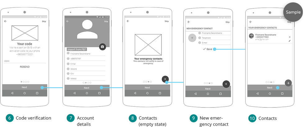
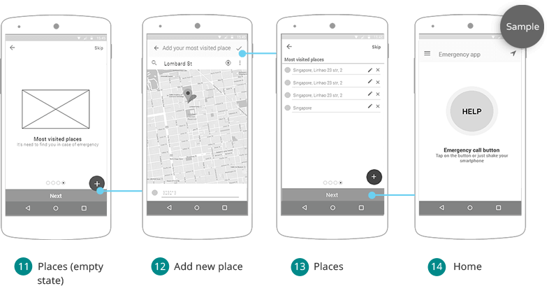
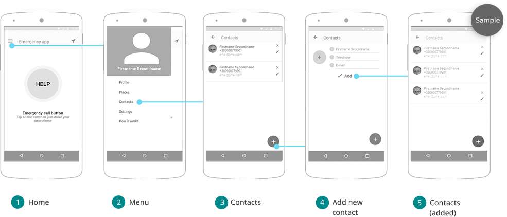
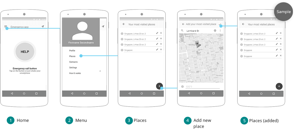
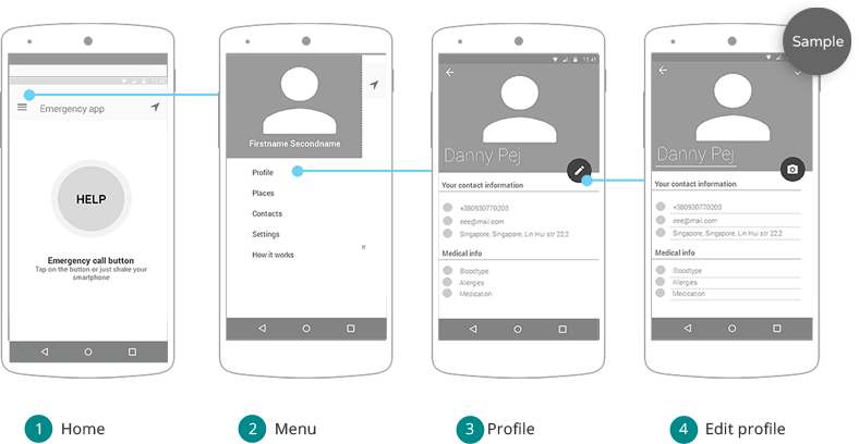
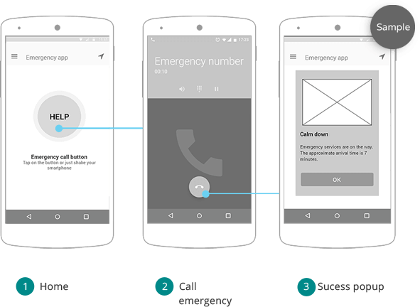
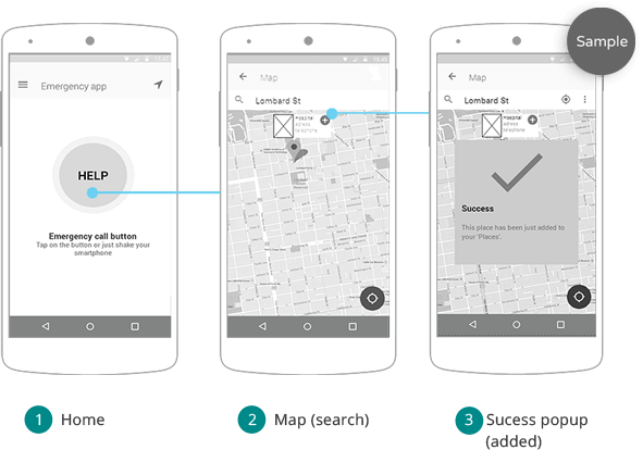
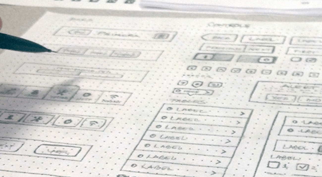
Wireframes are simple black and white layouts that outline the specific size and placement user interface elements, app features, navigation on the screens.User flow it’s the user pass to complite some goal in the app, like calling emergency, adding new place. It includes the steps that a user performs to complete the task, during using the app.
Wireframes & userflow need to prevent mistakes in subsequent stages. It saves time and money, because on this stage implementing changes for whole product are easier and cheaper than fixing design or development.
-
Sample:
Wireframes and Userflows was created according to the app architecture and user and business goals. For testing it was created interactive prototype.Testing was implemented by team (designers, developers, testers) and the real users. During the testing it was revealed mistakes of usability and changed the way implementation of features and placement of user interface elements.
According to our statistics, we saved about 20% of developer’s and 35% of QA’s time by creating accurate and well-designed wireframes.
